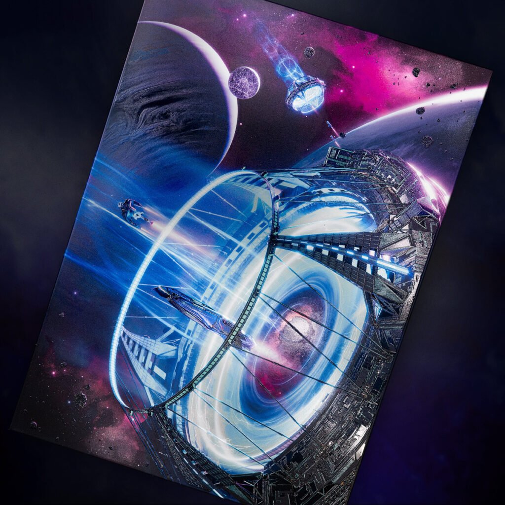
A portal, out in space.
How did it get here? How does it work?
But most importantly, why do we absolutely have to know what’s on the other side???
Something’s just pulling us close.
Could be our curiosity. Or the urge to touch those beautiful 3D-sculpted surfaces. Perhaps it’s simply the fantastic art of Tobias Roetsch!
After all, that’s what he set out to achieve when he came up with his first Ultra Limited Edition design, Into the unknown.
He admitted as much during our chat, where he also shared his fascination with science fiction and his methodical approach to painting. Step right through, we’ll see you on the other side. Probably.
Where no Ultra Limited had gone before
Tobias has a lot of space in his heart for space things.
But let’s lightspeed past this terrible wordplay and see what he has to say about it:
“When Displate contacted me to ask if I would be interested in creating an Ultra Limited Edition with them, they showed me a bunch of artworks they really liked. Some included space stations and portals. While looking at the portals I instantly knew what I wanted to do. I always loved portals. The distances in space are beyond imagining and portals or wormholes offer a way of transporting us to distant places in a much shorter time (maybe even within the blink of an eye). As a longtime Trekkie I was definitely inspired by the older Star Trek series “Voyager” and “Deep Space Nine” from my childhood. The Deep Space Nine station was placed next to a wormhole and the Voyager ship traveled back to Earth through a portal at some point. Those things make quite an impression on you as a child, they stay with you forever. And today I am able to create my own stories and basically live out my dreams. I hope that this image will help people escape their reality for a moment and daydream about other places.”
So Tobias’ love for spacefaring adventures goes way back. We had to know more:
“I started reading a lot of books about space as a child. A friend of mine had a telescope and he showed me Jupiter and its moons. It was absolutely mind-blowing for me that what looked like a star to the naked eye would turn into a planet with several moons just by looking at it through a telescope! All you have to do is look up at night and you’ll see millions or billions of stars, planets and galaxies. With such a large amount of galaxies and stars, I am convinced that there are other living beings out there. Earth cannot be the only “accident” where life became possible. This is a fascinating thought to me. On one hand, it’s a bit depressing to think that with today’s technology it’s quite unlikely that we’ll ever meet them. But it’s certainly exciting, and I think it is where my passion for space-related images comes from.”

Now the idea was taking shape in his mind. What next?
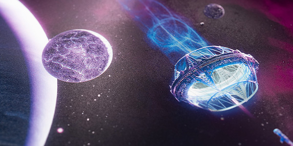
“Once the idea for the artwork was clear, it was time for some early concepts. I created some basic shapes and moved them around to check for good compositions. The ones I liked the most were sent to Displate for feedback. Once the setting was clear, I started working on the portal, which is the central part of the artwork. To increase the depth of the design, I decided to have a second portal in the background. Therefore I had to make sure that the smaller one also looked good. The finer details of the close-up portal are not that visible when moved to the background, but the general shape plays a big role. It was also supposed to look like a real space station and not just a ring.

Once I was happy with the shape of the station it was only a question of detailing it properly. Large structures always define themselves by the amount of little details. If the details are wrong, the viewer can’t understand the size of the thing. Other objects also help. In this case the ships are a good indicator. I knew the portal effect I had in mind would add a lot of light to the scene and the balance of the image could be compromised. The background with the nebula and starfield is supposed to help with that problem.
While the first part of the artwork was entirely done with Blender, the second half was Photoshop only. I improved the placement of some elements here and there (especially in the background). I tried several different looks for the portal/event horizon. At the end it was a decision between a very distorted look, like from a black hole, or a swirly/vortex-like look that may give a glimpse of what’s on the other side. Both ideas seemed equally cool to me, but I decided to go mostly with the vortex and minor distortions, because it implies a bit more movement and action in a still image.
The final touches were mostly about colors and light improvements. I really love the very last steps, because they always push the artwork in unexpected directions, revealing potential I hadn’t seen before. That “surprising part” is very satisfying”.

Tobias’ excitement for the project was palpable and we as our longtime collaborator in the Limited Edition project, we wanted to know his takeaway from this whole experience:
“I’m eternally thankful for the opportunity to turn my art into something special with the help of Displate. The Limited Editions we did together were so cool! Now the Ultra Limited Edition is the next step of this journey and I hope that all space-fans out there are going to appreciate this design as much as I do. The cooperation with Displate is always very smooth and productive, and it’s crazy what the team does with the artwork using all those cool printing techniques.
The only thing I feel sorry about is that the Limited Editions ALWAYS look better when you are holding them in your hands. There is nothing Displate can do for that, obviously. Pictures and videos are great but in the end the physical product can’t be matched. I guess, the only solution is to buy it! ;)“
Despite his detailed description of the process, watching Tobias work is even more interesting.
Check him out in this video:
Our Design Studio took the design to the stars!
With Tobias’ work done, it was time for our Design Studio to jump Into the unknown and explore what else technology could do for it. Product Designer, Ola Mosiej, and her fearless crew was on the case:
“We were really impressed with this huge construction!
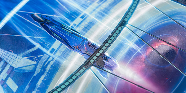
If you look closely, there’s a ton of textures and details on this eye-shaped teleport machine. We actually had to redraw all the details and put blue pearl powder on them so they would stand out from the shade.
Tobias is known for his impressive constructions and architectural details. That’s why we were happy to use his design for our Ultra Limited Edition, since the L size allowed us to show the exceptional amount of detail.
We used some varnish on the background to create extra depth of color and add some extra textures on this vast outer space.
The silver overprint let the colors shine and made them even more interesting. It’s like you’re there, gazing at the beyond!”
The star of your collection is waiting out there!
Going through a giant portal in the sky can be daunting. But when the portal looks like this, it’s impossible not to try it. The 3D-sculpted gate, the glossy spaceships, the blue pearl powder on the humongous construction – these are all valid reasons even before considering the promise of adventure that lies beyond.
But be warned, travelers: Ultra Limited Editions are known to disappear almost immediately after appearing on the horizon, so make sure to jump Into the unknown the moment it shows up!

